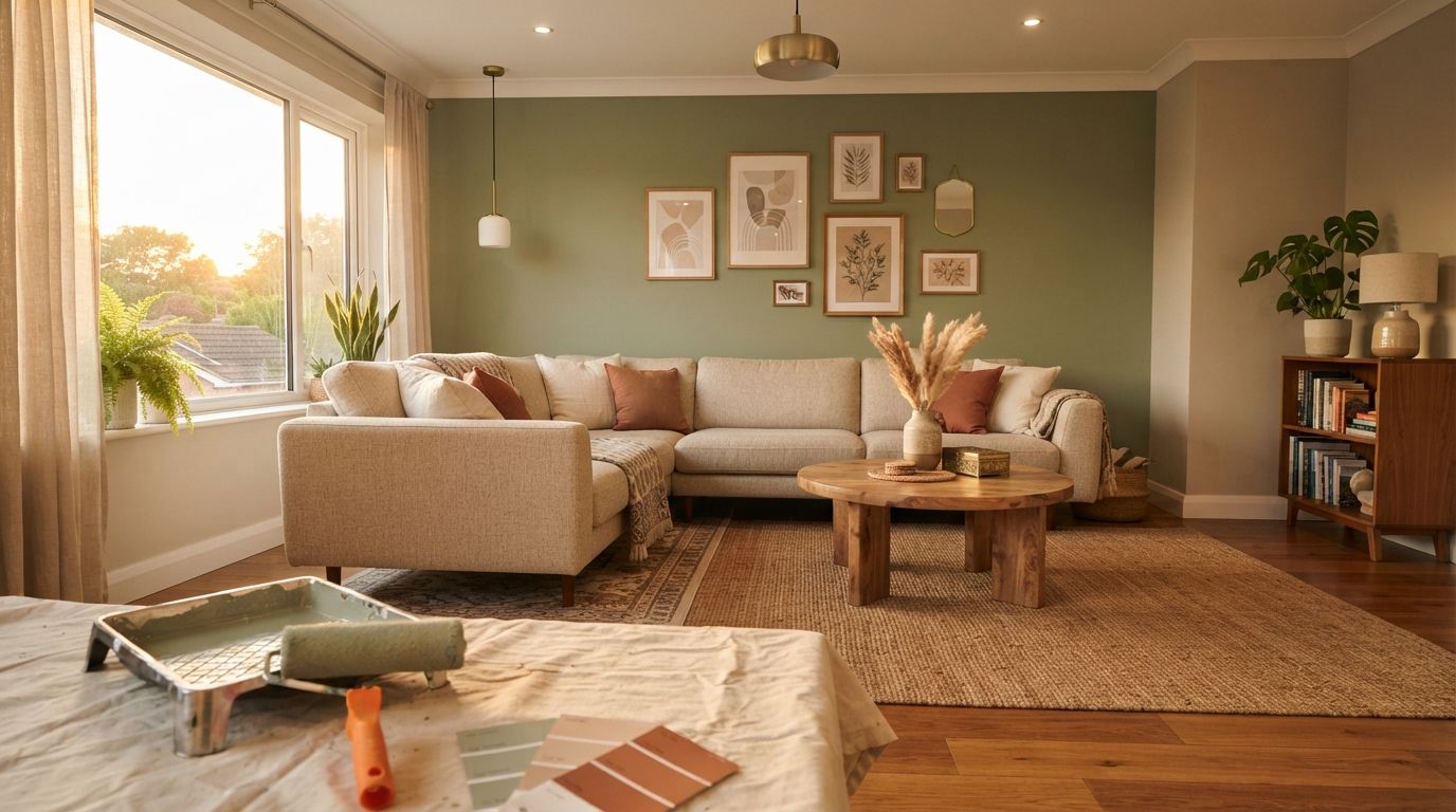
Wall colour is the cheapest interior decision that changes a room the most — and the one most Indian homeowners get wrong by picking a shade off a 2×2 inch chip under showroom light. A ₹15,000 paint job can look like a ₹1.5 lakh interior, or make good furniture look cheap, depending entirely on the combination and where each colour lands. Here's the room-by-room system designers actually use, in 2026 numbers.
The 60-30-10 rule (the only formula you need)
60% dominant — walls and ceiling, almost always a neutral or muted shade so the room doesn't tire the eye. 30% secondary — one accent wall, curtains or a large rug that carries the room's real colour. 10% accent — cushions, art, a lamp, decor pieces in the boldest shade you own. Rooms that feel "off" almost always break this ratio — usually too many walls trying to be the accent at once. Pick your 10% first (often a piece you already love), then build the 60% and 30% around it.
Living room combinations that work in Indian light
| Combination | Walls (60%) | Accent wall (30%) | Mood |
|---|---|---|---|
| Warm neutral | Off-white / warm greige | Terracotta or rust on the TV wall | Cosy, festive-ready, ages well |
| Modern sage | Soft sage green | Deep bottle green or charcoal | Calm, current, photographs well |
| Coastal blue | Off-white | Muted navy or teal | Airy, works with cane and wood |
| Earthy classic | Sand / beige | Deep brown or olive | Timeless, hides scuffs well |
North- and east-facing living rooms (cooler, bluer daylight) carry deeper accent colours confidently. West-facing rooms with harsh afternoon sun read warmer than the chip suggests — go one shade cooler than you think you want. A sheesham wood coffee table and a washable area rug in a muted tone anchor the 30% beautifully without competing with the wall.
Bedroom colours: what actually helps you sleep
Bedrooms are the one room where "trendy" should lose to "calming" every time. Saturated, high-contrast colours look great in photos and feel wrong at 11 pm.
- Dusty blue or slate: the most reliably calming shade across skin tones and light directions; pairs with warm wood furniture.
- Warm taupe/mushroom: the current designer default — neutral enough to resell, warm enough not to feel cold.
- Sage or eucalyptus green: works especially well with natural light and plants; avoid in very dark rooms.
- Deep colour, one wall only: a charcoal or forest-green headboard wall reads luxurious without overwhelming a small room — never do all four walls in a dark shade under 10×10 ft.
Keep the 10% accent — a bedside lamp set in brass or warm wood, or patterned cushion covers — in a colour that repeats somewhere else in the room (curtains, throw, art) so it reads intentional, not random.
Kitchen and bathroom: durability first, colour second
These rooms need washable, moisture-resistant finishes more than they need bold colour. Kitchens work well in warm white, soft yellow or sage on walls with a durable enamel or satin finish that wipes clean of oil splatter. Cabinet colour carries most of the visual weight here — matte navy, forest green or classic white cabinets against a neutral wall is the safest modern combination. Bathrooms should stay light (cream, pale blue, soft grey) since most Indian bathrooms have limited natural light; a single tiled accent wall does the "bold colour" job instead of paint, since paint peels faster in humidity.
From our shop
Decorate Your Home Like a Designer — The Complete Room-by-Room Guide
₹299 ₹999 70% off · instant PDF download
Our picks for this room
Paint finish guide
| Finish | Sheen | Best for | ₹ per litre (indicative) |
|---|---|---|---|
| Matte / flat | None | Ceilings, low-traffic bedroom walls | ₹280–450 |
| Eggshell | Low | Living rooms, bedrooms — the everyday default | ₹350–550 |
| Satin | Medium | Kids' rooms, corridors — wipeable | ₹400–650 |
| Semi-gloss / enamel | High | Kitchens, doors, window frames | ₹450–800 |
| Exterior emulsion | Weather-resistant | Balconies, external walls | ₹350–600 |
Higher sheen shows every wall imperfection, so plan putty and sanding accordingly — a semi-gloss wall over a poorly finished surface looks worse than matte over the same wall.
What painting actually costs (2026, per BHK)
| Home size | Basic emulsion, 2 coats | Premium washable emulsion |
|---|---|---|
| 1 BHK | ₹18,000–28,000 | ₹28,000–42,000 |
| 2 BHK | ₹28,000–42,000 | ₹42,000–65,000 |
| 3 BHK | ₹40,000–58,000 | ₹58,000–90,000 |
This covers walls and ceiling with putty and primer; add ₹3,000–8,000 per accent wall if it's a textured or metallic finish. Labour typically runs 40–50% of the total — the paint brand matters less to the final look than the number of coats and the putty finish underneath it.
What's in for 2026, and what's dating fast
- In: warm greiges and taupes, sage and olive greens, terracotta accents, one confident dark wall per room, tone-on-tone (two shades of the same colour family).
- Dating fast: stark cool grey-on-grey (2018-era), textured "sponge paint" walls, metallic gold accent walls, rainbow kids' rooms with four different bright colours.
- The safe long-term bet: a warm neutral base with one intentional accent wall per room — it photographs well, resells well, and doesn't need repainting when trends move on.
Mistakes that undo a good colour choice
- Cool-white (6500K) bulbs over a warm palette: the single biggest colour-killer. Warm 2700–3000K lighting is what makes greiges, taupes and terracottas look designed rather than dull — a warm-white LED bulb swap alone can rescue a wall colour you thought you hated.
- Testing on a white board instead of the wall: ambient bounce-light from adjacent walls changes the shade — always test in place.
- Matching furniture to the wall exactly: a sofa the same shade as the wall behind it disappears; contrast by two to three shades minimum.
- Skipping the primer on repaints: painting a dark colour over a light one (or vice versa) without primer means 3–4 coats instead of 2 — primer is cheap; extra coats aren't.
- One accent colour, four different intensities: pick the exact shade for walls, cushions and art from one palette rather than "roughly matching" — mismatched greens or blues read as a mistake, not a scheme.
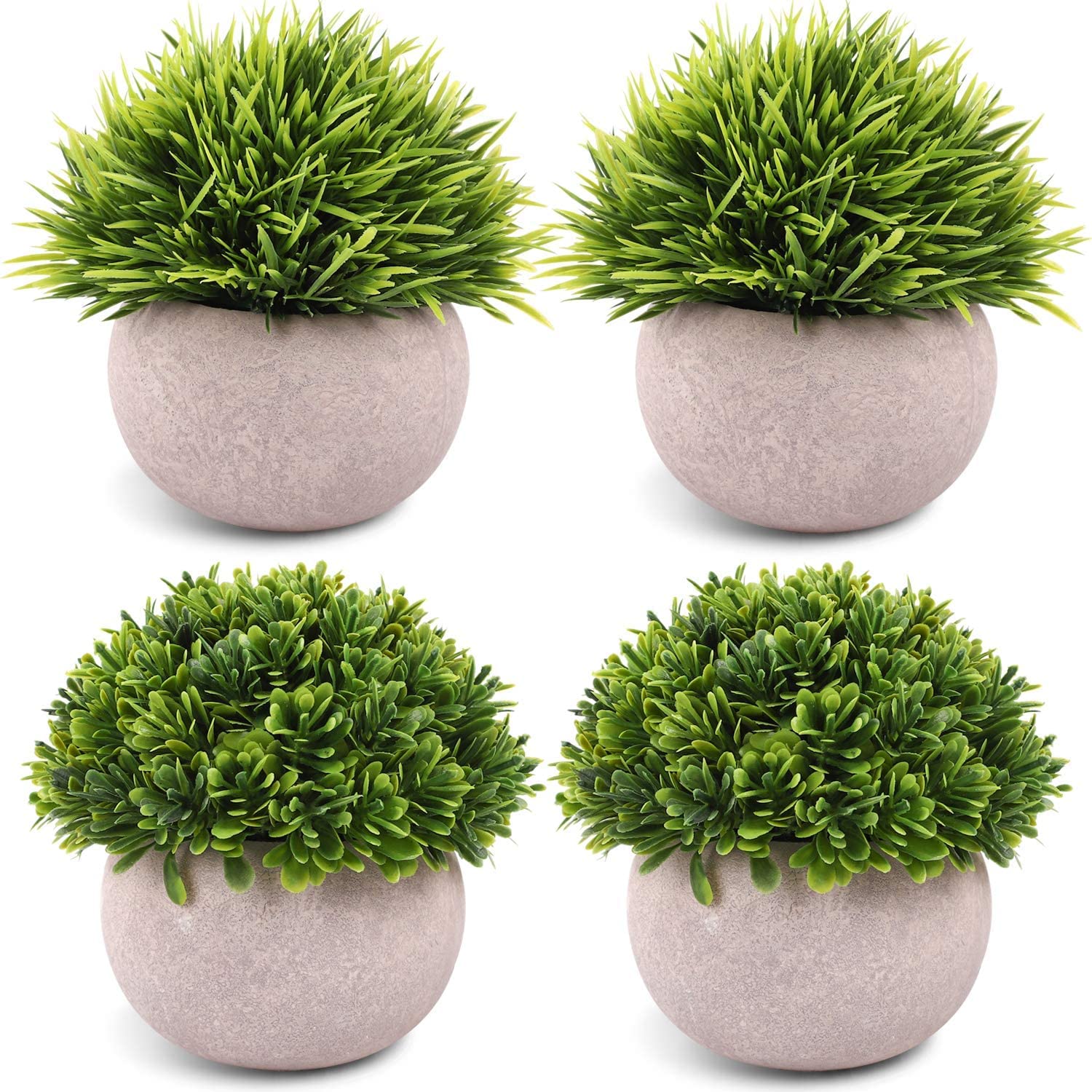
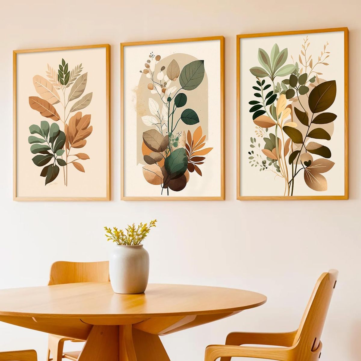
Once the palette is locked, small decor pieces do the final 10% — a set of framed wall art, an abstract wall clock, or artificial plants in pots pull the accent colour through the room without another coat of paint. For the ceiling and cove lighting that make a painted room glow after dark, see our false ceiling guide; for the fabric layer that should echo your accent colour, see the curtain guide.
Frequently asked questions
What is the best colour combination for a living room in India?
A warm off-white or greige on the main walls with one accent wall — terracotta, deep green or navy — behind the TV or sofa. This 60-30-10 approach suits most Indian light conditions and ages better than an all-over bold colour.
Which colour is best for a bedroom for sleep?
Muted, low-saturation shades — dusty blue, sage green or warm taupe — calm the room best. Reserve any deep or bright colour for a single accent wall, not the full room.
How much does it cost to paint a 2 BHK flat in India?
₹28,000–42,000 for basic emulsion in 2 coats, or ₹42,000–65,000 for a premium washable emulsion, covering walls and ceiling with putty and primer (2026 indicative, city and brand dependent).
How do I choose a paint colour without it looking different once painted?
Paint an A3-size sample directly on the wall and check it at three times of day under your own lighting — small chips and phone screens both distort the true undertone.
Should the ceiling be painted the same colour as the walls?
Usually no — a warm white or a 10–15% tint of the wall colour on the ceiling keeps the room feeling tall. Painting the ceiling the exact wall colour works only in small, cocooning rooms like a reading nook.
What paint finish is best for Indian kitchens?
Semi-gloss or enamel on walls near the cooking area — it wipes clean of oil and steam. Satin is a good middle ground for the rest of the kitchen where full gloss would show every imperfection.